These mockups illustrate how My Coach looks and feels in practice. They are concept screens — not final UI — but they show the core design decisions: the avatar in the corner, the culturally matched backgrounds, the distinct visual register of each module, and how the interface recedes to let the content lead.
Each scene is shown in three variants, exploring different avatar characters and background themes. This range is deliberate: it demonstrates the breadth of the matched representation system, where the Coach feels like it belongs to the learner's world.
→ Storyboard: Alyssa's Journey
→ Architecture Diagram
→ Look & Feel Direction
The first thing a learner sees after tapping "Let's go". The Coach introduces themselves directly — by name, in a conversational tone — and immediately signals the relationship: "You can speak to me like a mate." No assessment. No form. No learning objective. Just a person, talking.
What to notice: The avatar sits at the bottom of the screen in a pip-style overlay — present and speaking, but not dominating. The chat bubbles above show the Coach's opening lines. The background theme and avatar character change across variants, but the structure, message, and tone are identical. That consistency is the product.
Variant A — Emmy
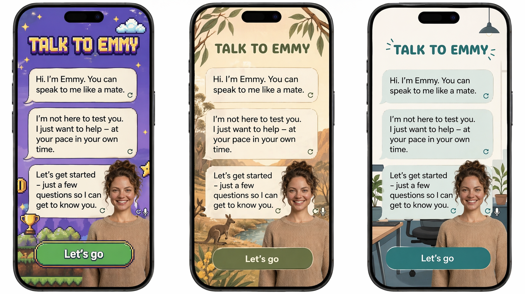
Emmy across three background themes — gaming, nature, and home. The avatar and message are consistent; the world behind her adapts to what resonates with the learner.
Variant B — Matt
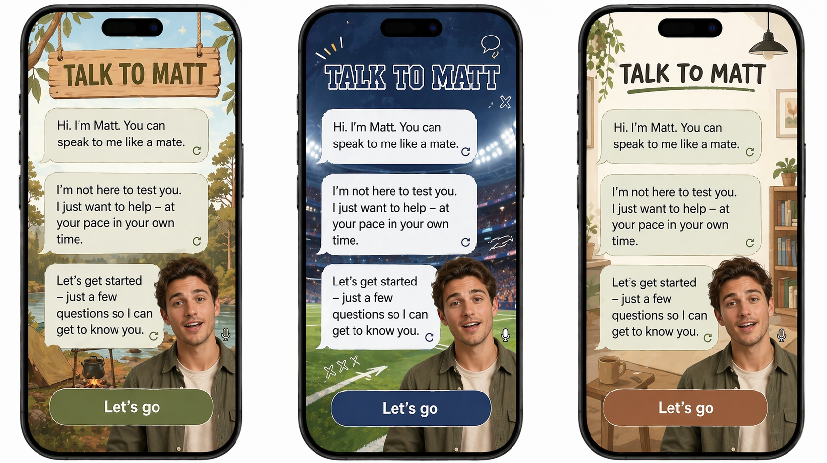
Matt across outback, stadium, and indoor settings. Different backgrounds signal different cultural contexts — the Coach adapts to feel like it belongs to the learner's world, not an institution.
Variant C — Sam
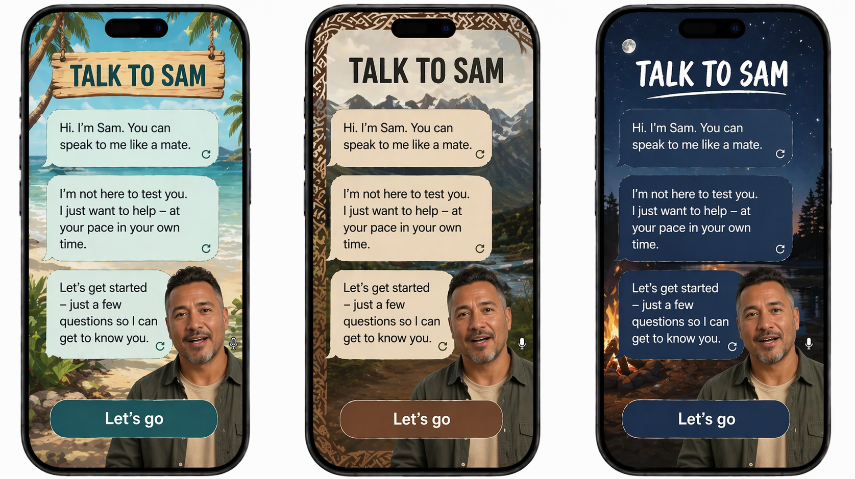
Sam across coastal, mountain, and campfire settings. The warmth and directness of "You can speak to me like a mate" reads the same in every context — the background is personalisation, the message is the constant.
→ See how this moment plays out in Alyssa's journey
→ Coach Personality & Interaction Model
During gameplay, the Coach completely steps back. No avatar in the corner, no conversation — just the game. The numeracy module has its own bold, immersive visual identity, distinct from the warm Shell. This contrast is intentional: it signals that My Coach has range, and that the Coach knows when to get out of the way.
What to notice: The Coach avatar appears only as a small pip at the bottom — present but not foregrounded. The game world is the thing. Three different theme sets show how the same core mechanic (answer the equation, pick the right number) can feel completely different depending on the scenario. The math is always grounded in a real-world context: shipping orders, counting a team, checking tools.
Variant A — Workplace scenarios
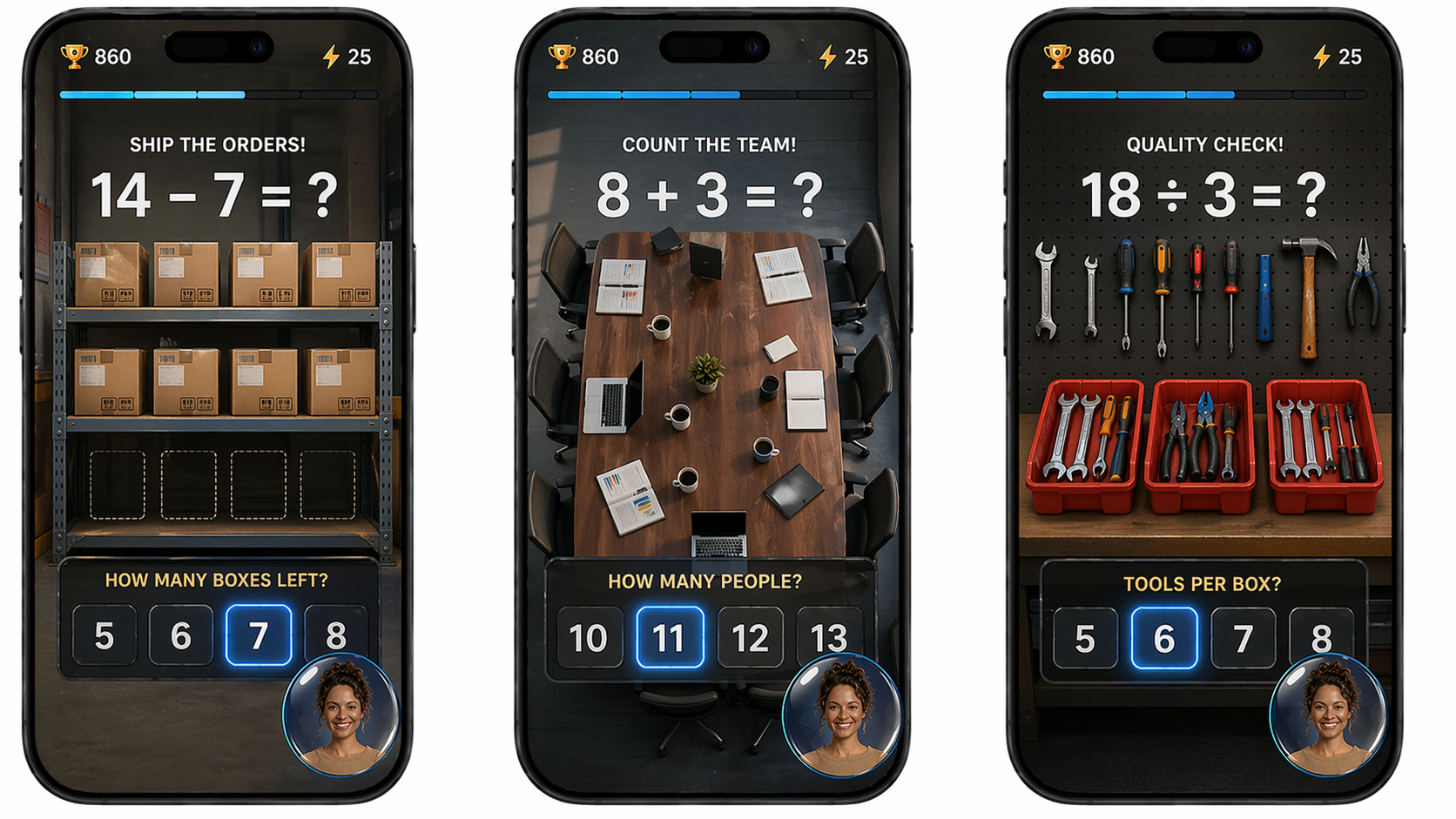
Workplace-grounded scenarios: counting boxes to ship, people in a team meeting, tools per box. The maths is identical to any other numeracy game — the framing connects it directly to the learner's working life.
Variant B — Adventure themes
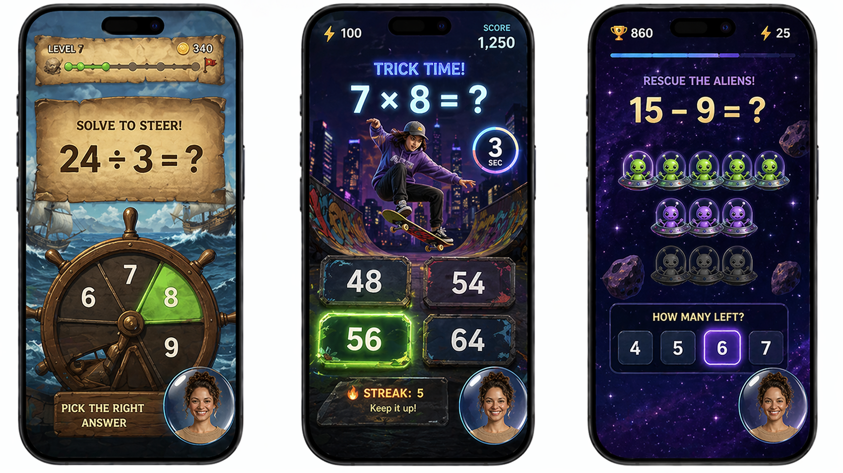
Pirate, skate, and space — high-energy game themes that make the same maths feel like play. The "Trick Time!" and "Rescue the Aliens!" framing shows how the difficulty and pacing can escalate while keeping the format immediately readable.
Variant C — Nature themes
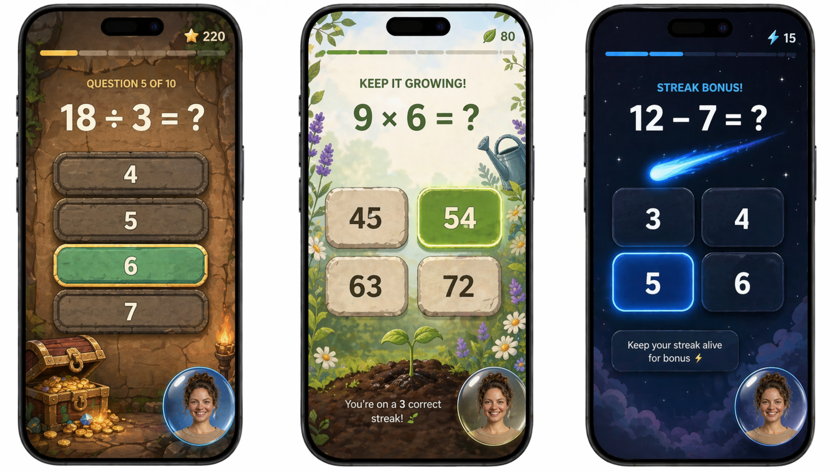
Treasure, garden, and night sky — calmer visual registers that still deliver the same game feel. The streak bonuses and score indicators are visible but never the dominant element. Progress is shown through momentum, not a grade.
→ Marcus's Numeracy Journey
→ Numeracy Module Features
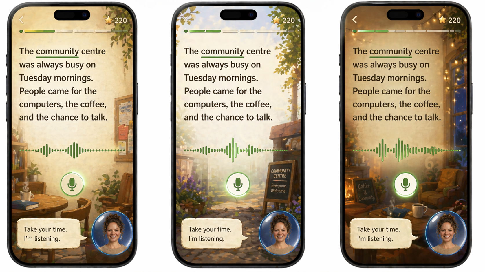
The reading module is built around one act: the learner reads aloud, and the Coach listens. The interface during reading is deliberately calm — the text is large and clear, the waveform shows that the Coach is actively listening, and the avatar sits quietly in the corner. "Take your time. I'm listening." That's the whole screen.
What to notice: The current word is highlighted as the learner reads — tracking without interrupting. The Coach is visible but quiet: listening, not grading. The background world shifts across variants (lakeside, stadium, garden, community centre) but the text, the waveform, and the Coach's posture are unchanged. Calm is the constant. The world adapts.
Variant A — Matt, natural settings
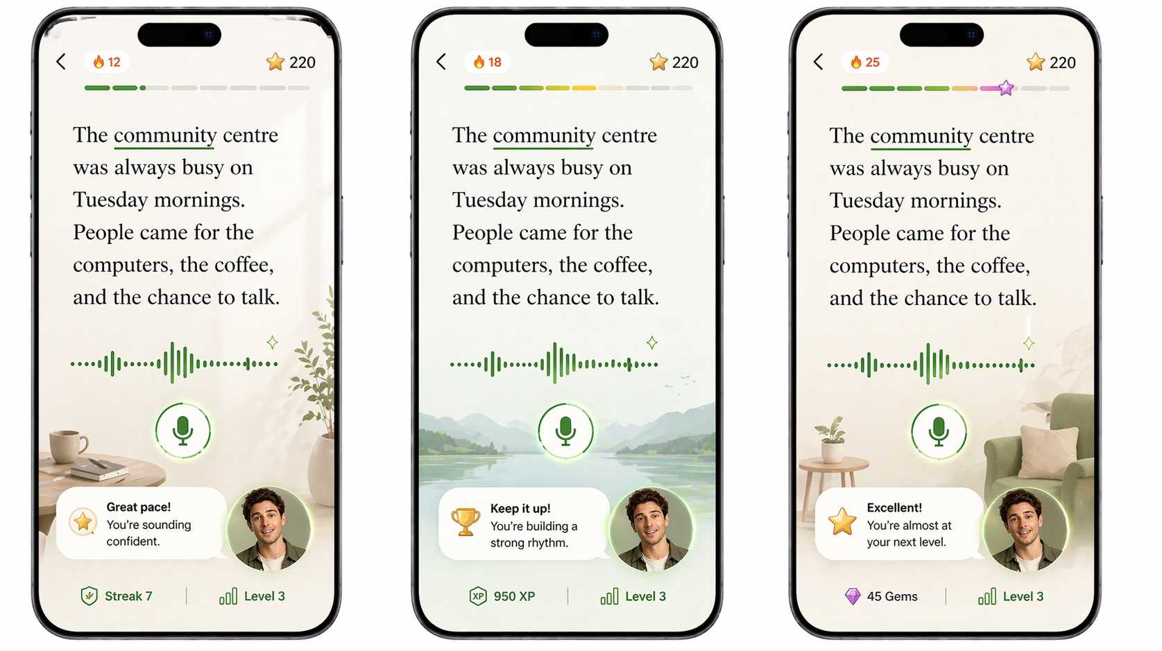
Matt listening across lakeside, stadium, and garden settings. The text is the same passage in each — "The community centre was always busy on Tuesday mornings" — grounded in a world the learner already knows. The environment behind it shifts to feel familiar.
Variant B — Matt, community settings
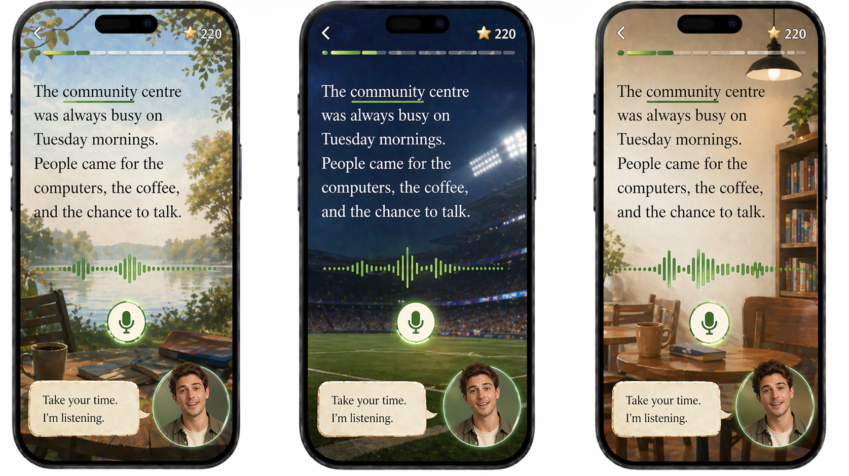
A community noticeboard, a reading room — backgrounds that reflect the learner's actual world, not a generic app aesthetic. The Coach's prompt ("Take your time. I'm listening.") appears the same in every variant. Patience is the design.
Variant C — Emmy
Emmy as the reading Coach — a different avatar, the same calm presence. The module's visual register doesn't change with the avatar. Whichever Coach a learner was matched with during onboarding, the reading experience feels the same way.
→ Alyssa's Reading Journey (storyboard)
→ Full Journey Narrative
→ Reading Module Features
What the mockups show together
Read as a set, the three scenes make the architecture argument visually. The Shell (Coach Arrives) establishes the relationship — warm, direct, matched to the learner. The modules (Numeracy Game, Reading Aloud) each have their own distinct register, but the Coach is the constant that moves between them. The learner doesn't start over. The Coach already knows them.
The range of backgrounds across variants also makes a quieter argument: personalisation is not cosmetic. A learner who sees a Coach standing in a world that looks like theirs — bush, beach, community centre — experiences something fundamentally different from a learner looking at a generic app. That difference is the product.
→ Architecture Diagram
→ Look & Feel Direction
→ Persona Profiles